
Your Font Choice Speaks Before Your Copy Says a Word

Here's what most people get wrong about designing print materials: they think the words are doing all the heavy lifting. They're not. The font is carrying some of the lift, too.

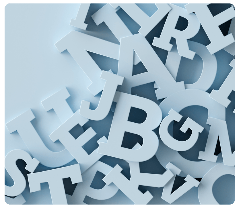
Why is this? Before someone reads a single sentence, they're absorbing a message from your typography. Is this professional or casual? Trustworthy or trendy? Approachable or formal? The font answers those questions in milliseconds.

That's why font choice matters more than people realize. It's also why most DIY designers struggle. Not because fonts are complicated, but because they don't understand what they're communicating.

One Personality, Not Five

The easiest way to look amateurish is to use too many fonts. You see it constantly: a headline in one style, body copy in another, subheads in a third, callouts in a fourth. The piece feels chaotic before anyone reads anything.

Limit yourself to two fonts, maybe three if you're confident. One for headlines and one for body copy is usually enough. This constraint leads to better design because you have to make every font choice intentional rather than just grabbing whatever appeals to you.

Fonts Have Personality

A rounded sans serif feels friendly and approachable. A clean geometric sans serif projects strength and modernity. Serif fonts (the ones with little lines at the ends of letters) suggest elegance and tradition. A handwritten-style font feels personal and creative.

These aren't subjective impressions. They're established associations. If you're designing a mailer for a financial services company, you don't want a playful, rounded font. If you're promoting a kids' event, a formal serif font sends the wrong message.

Think about what you want people to feel when they see your piece, then choose fonts that reinforce that emotion.

The Spacing Problem Nobody Talks About

Most people focus on font choice and ignore spacing. That's backward. Bad spacing makes even good fonts look amateurish.

Proper spacing between letters, lines, and paragraphs makes copy easier to read. It also changes how the piece looks. A tightly spaced block of text feels cramped. Too much space and letters feel disconnected from each other. You need the middle ground.

The tricky part is that spacing that looks right on your screen might not look right when printed. Test it. Get feedback from people whose design judgment you trust. Small spacing adjustments can make the piece more inviting and easier to read.

Consistency Across Everything

If you're creating multiple pieces, such as a mailer, a brochure, and a follow-up postcard, they should look like they came from the same company. That comes from consistent font choices.

Use the same fonts across all materials. Maintain similar hierarchy (headline sizes, body sizes, spacing). This doesn't mean everything looks identical. It means people recognize your brand from the typography alone.

Creativity Within Constraints

Most typeface families come with variations, such as italic, bold, condensed, and light. Even if you stay within the same font family, you have more creative options than you may realize. A bold headline paired with regular body copy with italic callouts (all from the same family) looks polished and intentional.

This is where beginners go wrong. They think they need variety, so they grab different fonts. Professionals stay in one family and use variations for flexibility.

Start Simple, Build From There

If you're designing without professional experience, simplicity is your advantage. Pick a font that matches the tone you want. Limit your choices. Pay attention to spacing. Keep it consistent.

You don't need dozens of fonts or complicated design rules. You need intentional choices that communicate clearly.

That's how you move from "I designed this myself" to "this looks professional."

Timing Is Everything: Why Even Perfect Creative Flops with Bad Timing

You've nailed the design. Your mailing list is perfectly targeted. Your call to action is crystal clear. Everything should work. Then your campaign lands in mailboxes at the wrong time. Response rates tank.

Bad timing destroys even the best direct mail campaigns. It doesn't matter how brilliant your creative is if you're asking people to act when they're not ready, thinking about something else, or have already solved the problem you're addressing.

Let’s look at three real-life examples.

The Fundraising Letter That Arrived Too Late

A nonprofit spent weeks perfecting a year-end fundraising letter. The design was beautiful. The case for support was compelling. The letter was mailed on November 29th.

Giving Tuesday was December 2. The nonprofit’s appeal arrived on December 4. By then, many donors had already committed their annual gifts elsewhere. The campaign flopped, not because the letter was bad, but because it arrived several days too late.

The lesson? Understanding your audience's decision calendar matters as much as understanding your audience.

The Snowmelt Offer in the Wrong Season

A facility management company sent a direct mail campaign promoting snowmelt products in October. The design was great. The offer was strong. But facilities managers buy snowmelt in June and July. The October mailer arrived when buyers had already purchased everything they needed for winter. Sales? Zero.

The Season Ticket Offer Halfway Through

A university sent alumni a beautiful brochure promoting season tickets to spring lacrosse games. The piece arrived in late April, halfway through the season (and after all the home games had been played). Most interested fans had already purchased individual game tickets. The campaign had missed the natural buying window by weeks.

Plan Backward From Action

The best campaigns work backward from when prospects are ready to buy. Fundraisers should arrive before major giving deadlines. Seasonal offers should hit mailboxes before the buying season starts. Event promotions should land with enough lead time for people to plan.

Your mailing schedule matters as much as your list. Spend time mapping when your audience makes decisions, then time your campaigns to arrive when they're thinking about the problem you solve.

Need help? Contact one of our mailing specialists!

Why Wide-Format Printing Is Having a Moment

Wide-format printing is booming. It's not just because bigger is flashier. There are some genuinely smart reasons why more businesses are investing in it.

Images That Actually Stop People

Think about how high-resolution images work on your direct mail. They catch attention. Now imagine those same images blown up to 10 feet long.

Today's wide-format printers produce stunning quality you can see from across a room (or across a parking lot). That's a huge shift from traditional printing. Your visuals command attention at scale in ways traditional-format printing simply can't match.

Print On Basically Anything

Wide-format inks stick to vinyl, plastic, fabric, metal, and even composite materials. Not just paper.

That means your message doesn't have to stay confined to a brochure or postcard. It can live on walls, vehicle wraps, outdoor banners, floors, and windows. It can live anywhere you want to put it. Suddenly, you're reaching customers in places traditional printing never could.

Color That Pops

Most wide-format printers use eight or more ink colors (including white). That's a lot of chromatic power. The result? Graphics that jump off surfaces and photorealistic images that feel almost three-dimensional.

Traditional printing can't create that visual intensity. Wide-format just does it differently.

Put Your Message Where Customers Actually Are

Here's the strategy part: Size and substrate flexibility let you place messaging in high-traffic zones. Bus stops, retail storefronts, building exteriors, vehicle sides. Locations where your target audience spends time.

Most marketing channels fight for attention in crowded spaces. Wide-format lets you own physical real estate where customers can't miss you.

Get Creative (Really Creative)

When you're not limited by paper size and traditional printing constraints, things get fun. Think: Life-size character cutouts. Massive logo installations. Full-wall murals. Dimensional displays that interact with spaces.

Wide-format removes the guardrails. It's an invitation to push boundaries and try things traditional printing won't let you do.

It's About More Than Size

Wide-format's explosive growth isn't about ego or wanting things bigger for bigger's sake. It's about creating immersive brand experiences. It's about positioning your brand in environments where customers encounter it daily. It's about making messaging memorable through sheer visual intensity and unexpected placement.

Want to be unforgettable? Tap the benefits of wide-format print.

Leading with Print: Why It’s So Important to Your Marketing

A truly optimized marketing strategy starts with physical materials (direct mail, postcards, brochures, catalogs), then reinforces those touchpoints with digital follow-up. Instead of treating print as an afterthought or a “nice to have,” fully optimized marketing uses print as the foundation of your marketing to engage your audience, then uses email and digital channels to extend the conversation.

Why Start with Print?

Physical mail gets opened and read. Research shows 42% of recipients read or scan direct mail immediately, compared to email open rates hovering around 20%. Print materials stay visible on counters, refrigerators, and desks, creating many exposure opportunities over time. Digital messages disappear into crowded inboxes within seconds.

Trust matters too. Studies show 76% of consumers trust direct mail when making purchase decisions, compared to just 38% who trust digital ads. When you lead with print, you’re leading with the channel customers trust most.

What Print-First Looks Like in Practice

What does this look like in practice?

Local Service Business (HVAC, Plumbing, Landscaping): Mail seasonal postcards to your customer list and surrounding neighborhoods announcing tune-up specials or service reminders. Follow up with non-responders via email three days later. The postcard establishes credibility. The email creates urgency.

Retail Store: Send a printed catalog or product showcase quarterly, featuring QR codes linking to online ordering. Customers browse at their leisure, then shop when they are ready. Email reminders between mailings keep your brand visible without relying exclusively on digital.

Professional Services (Accounting, Legal, Financial): Mail printed newsletters to clients and prospects, sharing insights and updates quarterly. The physical newsletter is the expert resource they keep on their desk. Email supplements with timely updates between print editions.

B2B Company: Send dimensional mail (packages with samples or promotional items) to top prospects, followed by personalized email referencing what you sent. The physical piece demands attention. Digital follow-up keeps the momentum going.

The Multi-Channel Advantage

Leading with print doesn’t mean digital-never. It means recognizing that physical mail cuts through the noise, builds trust, and drives engagement. Once you’ve captured attention with print, digital channels extend your reach and enable rapid follow-up.

Response rates prove the strategy works: direct mail generates higher response rates than email, but when the channels are combined, response rates jump even higher. Physical and digital reinforce each other.

Ready to get started? Talk with us about beginning with one quarterly mailing to your customer list. Add digital follow-up to non-responders. Track which combination drives best results, then expand from there.

Optimizing your marketing with a “print leading” strategy isn’t complicated—it just works.

Making Your Direct Mail Work Harder: Tips for Postcards and Direct Response

Direct mail is one of the most personal channels in a marketer’s toolkit. When someone holds your postcard, they are holding your brand. That moment is brief, but it is yours to own.

Word Count Is Dropping, and That Is a Good Thing

Research from Who’s Mailing What!, a database of nearly 200,000 direct mail pieces, shows that average word counts have dropped significantly over the past two decades. Postcards are down roughly 30%. Self-mailers are down nearly 29%. Even envelope mailers have shed about 24% of their copy.

This is not laziness. It is discipline. Attention spans are shorter, and mail that respects the reader’s time consistently outperforms mail that demands it. Say less, say it better.

Lead with the One Thing That Matters Most

Your most compelling point needs to be front and center. On a postcard, you have roughly three seconds before someone decides whether to keep reading. Ask yourself: if a prospect reads only one sentence, which one do you want it to be? That sentence belongs at the top.

Focus on the Reader, Not Your Company

Copy that leads with “We have been in business for 30 years” is talking to itself. The shift that improves response rates is moving from company-centric to customer-centric language. Instead of “We offer fast, reliable service,” try “Is slow service costing you business?” The first is a statement. The second is a conversation starter. Answer the reader’s first question before anything else: What is in it for me?

Design for Scanning

Most recipients scan before they read. A few design principles consistently improve engagement:

  • White space signals confidence, not waste. Crowded layouts feel desperate and are harder to process quickly.
  • A clear visual hierarchy guides the eye from headline to call to action.
  • One focal point per side keeps the message from competing with itself.

Keep the Call to Action Simple

One clear next step outperforms a list of options. Direct mail’s job is usually just to open the door. Visit this URL, call this number, stop in. The conversion happens later. Ask for something reasonable and make it easy to say yes.

A Few Things to Avoid

  • Vague benefits. “Quality service” and “competitive pricing” mean nothing. Be specific.
  • Too many fonts or colors. They create visual noise that undermines your message.
  • No reason to act now. A deadline or limited offer creates urgency without pressure.

Direct mail rewards focus. Nail the fundamentals with shorter copy, cleaner design, a customer-first message, and one clear next step, and your mail will stand out in any mailbox.

In the Age of AI, Print Marketing Is More Important Than Ever

AI has changed the face of marketing, and not just for the businesses using it. It has reshaped consumer expectations across the board, which means even businesses not deploying AI tools are feeling its effects.

According to HubSpot's 2026 State of Marketing report, which surveyed 1,500 marketers about their priorities, goals, and challenges in the age of AI, 61% say that in a marketing universe flooded with “AI slop” (low-quality, high-volume AI-generated content that lacks the human touch), brand personality and point of view matter more than ever. Nearly two-thirds (63%) say they need more unique, human-centered content to stand out.

Print’s Edge in the AI Age

That's where print has an edge. In a landscape drowning in algorithmically generated content, something physical and well-crafted cuts through in ways that AI “slop” simply can't.

Here's how marketers are keeping their marketing fresh, relevant, and effective in 2026, according to HubSpot:

75% use five or more distinct marketing channels. Use print as the anchor of your marketing mix and weave in other channels as appropriate to your audience. The channel mix that works for one business may not work for another.

85% revisit their brand identity quarterly or annually. Design trends shift. Audience needs and motivators change over time. Regular audits of your marketing materials keep everything current, and short-run digital printing makes it easy to update in smaller quantities without the cost of overprinting.

93% report that personalization improves lead generation or conversion rates. This doesn't have to be complicated. Even one well-chosen data point can meaningfully elevate response rates.

80% use AI for content creation. (But smart marketers pair it with human context and voice.) That includes refreshing and customizing print marketing materials for different audiences quickly and efficiently.

AI may be flooding the market with content, but understanding how your buyers feel and knowing how to connect with them will always be a human's job.

Savvy marketers use AI to clarify and elevate their thinking, not replace it. Combine that with a strategic marketing plan with print as the base, with the right mix of digital channels layered on top, and you have a winning combination for 2026 and beyond.

Direct Mail Is Quietly Driving More Sales Than You’d Expect

There's a common assumption floating around marketing circles that print is on its way out. Why bother with a postcard when you can send an email in seconds? It's a fair question, but the numbers tell a very different story. Direct mail isn't just surviving in the digital age; it's actively pushing people online and turning browsers into buyers.

The Holiday Season Proves the Point

The holiday shopping season is one of the best pressure tests for any marketing channel. Consumer spending is high, competition is fierce, and attention is scarce. A study by Bain & Co. just a few years ago showed that 76% of holiday shoppers planned to do at least half of their shopping online. So what got them there? For nearly 1 in 5 shoppers, it was a piece of mail. That's a meaningful number for a channel that supposedly nobody pays attention to anymore.

Younger Audiences Are Paying Attention

Here's where things get interesting. When researchers looked at which generations were most influenced by direct mail, Gen Z came out on top at 23%, ahead of Boomers at 18%, Millennials at 16%, and Gen X at 10%. The most digitally connected generation is also one of the most responsive to physical print.

This isn't really a contradiction if you think about it. Gen Z grew up with screens everywhere. A well-designed piece of mail stands out precisely because it's different. Research from Keypoint Intelligence found that Gen Z checks their mailbox more often than Millennials, at 43% versus 36%. And 51% of Gen Z reported purchasing within the last six months as a direct result of receiving mail. That's a conversion stat worth paying attention to.

Gender also factors in. Men were nearly twice as likely as women to make an online purchase after receiving a mail piece, 21% compared to 12%.

What Makes People Act

Knowing that direct mail works is one thing. Understanding what motivates a response is where strategy comes in. Discounts are always popular, but free shipping topped the list of non-discount offers at 61%. Loyalty points, bonus gifts, and free returns followed behind. Put your best offer front and center and make it easy to act on.

The Takeaway

Print has a real and measurable role in any marketing mix. It drives online traffic, reaches younger audiences meaningfully, and creates a tangible connection that digital cannot replicate. Your next campaign deserves a printed piece in the mix.

AI-Generated Marketing Images: Handle with Care

Need images for your direct mail pieces? Brochures? Social media posts? For many marketers, AI is the first place they turn. Certainly, AI offers a tantalizing deal: unlimited visuals, zero photoshoots, and creative freedom that laughs at physics. The reality? It’s complicated.

The upside is undeniable. Custom photography costs thousands and takes weeks. AI delivers dozens of concepts before your second cup of coffee. Need fifteen variations for A/B testing? Done. Want to personalize hero images across demographics or channels? Easy.

But here’s where the honeymoon ends.

Don’t Torpedo Audience Trust

Audiences have developed a sixth sense for AI-generated content, and that subtle “off” quality can quickly torpedo trust. Your meticulously crafted brand guidelines (those precise Pantone colors, carefully composed layouts, signature visual tone) can evaporate when an AI algorithm takes over.

Plus, AI is still known for making mistakes. Mangled hands. Gibberish text on packaging. Warped furniture that belongs in a fever dream. These things happen less frequently than they used to, but they still happen.

The legal landscape remains murky, as well. Training data controversies and licensing ambiguities create genuine risk, especially for brands in highly regulated industries. Meanwhile, everyone’s using the same tools, often with the same lazy prompts, flooding the market with identical-looking imagery. Your “unique” vision becomes visual wallpaper.

AI Still Needs Humans

What’s the answer? AI is a tool. Like any tool, the more we learn it and gain experience with it, the better it will get.

Sure, AI can create a blog header in a matter of seconds. But producing genuinely on-brand, campaign-ready assets will take more time. Make the effort to master things like prompt engineering, negative prompts, style consistency, and post-processing finesse.

AI still needs a human creator. Always use a strict review process. Every output needs a set of human eyes.

AI is an incredibly powerful accelerator when used thoughtfully, perfect for ideation, rapid prototyping, and volume production where perfection isn’t paramount. But don’t treat it as a magic replacement for creative strategy and quality control. That part still requires you.

Is Your Print Marketing Stuck in the Past? It’s Time for a Refresh!

Just as homes accumulate clutter requiring periodic purging and updating, marketing libraries need decluttering and refreshing, too.

Design trends change. Markets change. Customer priorities evolve. As a result, that brochure from two years ago can start to look outdated pretty quickly. That postcard with the now-discontinued product in the background undermines credibility. Copy reflecting customer priorities from last year no longer resonates today.

What should you do? Identify what still works, eliminate what doesn’t, and refresh what deserves updating.

How Easy Is It to Refresh Print Marketing Content?

Many businesses delay updating materials, assuming they require massive time and budget investments. That’s not always true, and refreshing print materials almost always costs significantly less than creating new ones from scratch.

Often, you don’t need complete redesigns. Updating images, refining messaging, or incorporating fresh design elements can breathe new life into your existing print materials. AI can be used to update existing copy and create new versions targeted to different customer groups or market verticals.

Start with one of your highest impact channels: direct mail. Why? More than three-quarters (76%) of consumers trust direct mail more than digital channels when making purchase decisions; 49% view brands that send mail as more credible, and only 38% trust digital ads.

This trust advantage makes direct mail invaluable, but only when materials appear current and professional.

What Happens When Print Materials Look Outdated?

Just as updating your direct mail has a strong upside, not updating it has a strong downside. Stale designs damage credibility, suggesting your business hasn’t evolved. Outdated imagery or messaging signals you’re behind the curve. Conversely, beautifully designed, embellished mail communicates quality and professionalism, building consumer confidence.

Once you’ve started with your highest-impact channel, direct mail, follow with customer-facing sales materials (brochures, product sheets), trade show materials that customers handle directly, and welcome kits that create first impressions with new customers.

Recent data shows refreshed, quality print marketing delivers 161% ROI and 4-9% response rates (versus 0.12% for email).

What Results Can Updated Print Marketing Deliver?

Don’t let outdated materials represent your brand. Let us help you audit existing materials, recommend cost-effective embellishments, and create campaigns that generate measurable results.

Ensure that your materials reflect current brand excellence. Contact us to refresh your marketing library and leverage print’s trust advantage.